

"Imperfect by Design": Why Raw Aesthetics Win in 2026
- Samuel Bohon

- Jan 9
- 2 min read
Updated: Jan 12
In 2026, we’ve reached a digital saturation point. For the last few years, our feeds have been flooded with the "perfect" output of generative AI—symmetrical faces, flawless gradients, and hyper-polished layouts. But as the "uncanny valley" of AI becomes our everyday reality, a quiet rebellion is taking place in the design world.
We’re calling it "Imperfect by Design."
Over the last few months I’ve been seeing a massive shift away from the sterile and toward the soulful. Here is why raw aesthetics are the ultimate power move for your brand this year.
The Rise of "Notes App" Chic
Remember when the most authentic thing a celebrity could post was a screenshot of their iPhone Notes app? That energy has officially taken over professional design.
"Notes App" Chic is a celebration of the unfinished. It’s a design language that uses:
Monospaced fonts that feel like a draft.
Minimalist, unstyled containers that mimic a digital scratchpad.
Hand-drawn scribbles circling key text, as if someone just pointed it out to you in a meeting.
This aesthetic works because it signals immediacy. It tells your audience: "This thought is fresh. It’s honest. It hasn't been scrubbed by a marketing committee for three weeks."
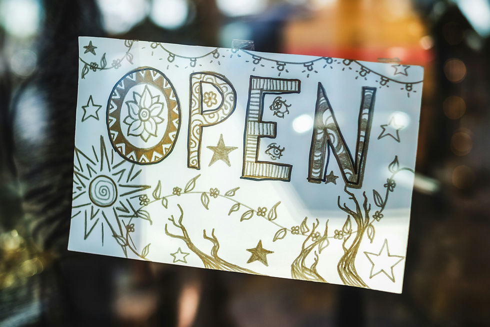
Authenticity in the "Ink Traps"
In a world of infinite pixels, we are craving tactility. Designers are now intentionally "breaking" their digital work to make it feel physical. We’re seeing a resurgence of:
Ink Traps: Those little notches in font corners originally designed to prevent ink from bleeding on newsprint. Today, they are used as a stylistic "human" touch.
Paper Grain & Textures: Subtle noise overlays that make a screen feel like something you could touch.
Organic Asymmetry: Layouts that don't perfectly align with a 12-column grid. They breathe, they lean, and they feel like they were placed by a hand, not an algorithm.
Why It Works: The "Human" Signal
Why is "messy" winning? Because imperfection is a verification of life. When a design features a slightly wobbly hand-drawn arrow or a texture that looks like scuffed vellum, it acts as a visual "Proof of Human." In 2026, authenticity is the rarest currency. By embracing "human errors," brands are building deeper trust with audiences who are increasingly skeptical of anything that looks too "generated."
Ready to get real?
Your brand doesn't need to look like a stock photo; it needs to look like you. Whether you want to refresh your site with a more organic layout or integrate hand-drawn elements into your next campaign, I’m here to help you find that perfect balance of professional and personal.
Would you like me to audit your current brand assets to see where we can inject some of this authentic, "Imperfect by Design" energy? Contact me today if you need help with a project or just want to chat about where design is headed!


Comments