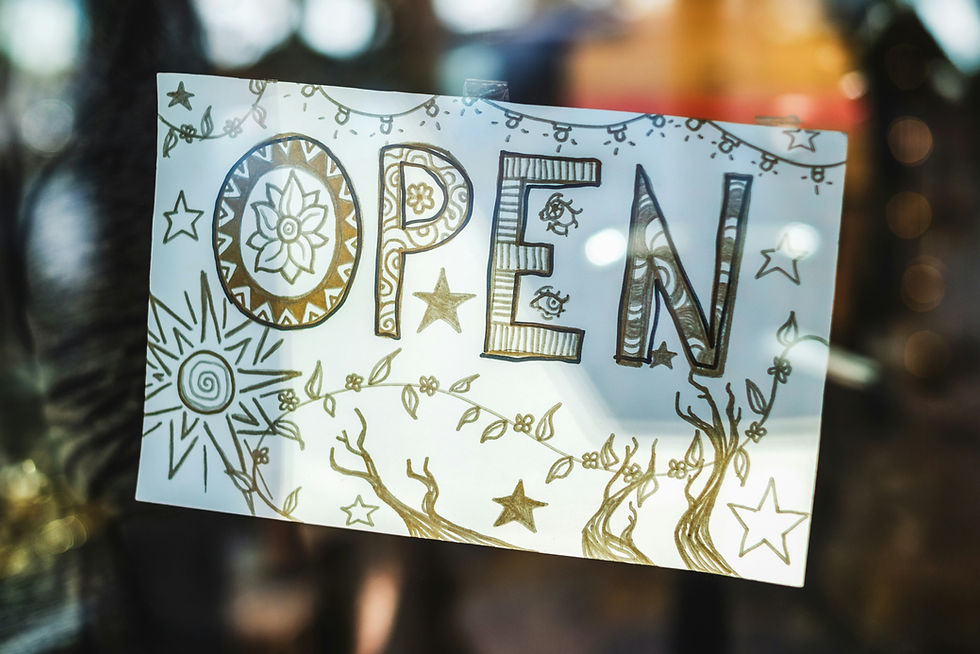
✨ Minimalism Meets Maximalism: Balancing Simplicity and High-Impact Design
- Samuel Bohon

- Oct 5, 2024
- 3 min read
Updated: Nov 1, 2025

Welcome back to SamBohon.Digital!
For years, the design world seemed to operate on a pendulum swing: either stark, "less-is-more" minimalism or vibrant, "more-is-more" maximalism. But as we navigate a visually saturated digital landscape, a fascinating new trend has emerged that defies easy categorization: Minimalism Meets Maximalism.
You might hear it called "bold minimalism," "maximalist minimalism," or simply a "hybrid approach." Whatever the label, it's about artfully blending the clean, functional aesthetics of minimalism with strategic, high-impact elements often found in maximalist designs. This month, I’m going to explore how we, as marketing and graphic design professionals, can use striking typography, high-contrast colors, or a hint of retro flair within a clean, modern design framework to create truly unforgettable visuals.
The Evolution: Why We Need Both
Pure minimalism, while elegant, can sometimes feel cold or generic in a crowded market. Pure maximalism, while exciting, risks becoming overwhelming or chaotic. This new hybrid approach offers the best of both worlds:
From Minimalism: We retain clarity, functionality, ample white space, and a strong sense of order. This ensures readability and a sophisticated feel.
From Maximalism: We inject personality, vibrancy, unexpected details, and a memorable edge. This captures attention and communicates a distinct brand voice.
The goal is to create designs that are visually intriguing and full of personality, yet still feel refined and easy to digest.
Striking the Balance: Key Design Strategies
1. The Power of Striking Typography
Typography is often the star in this hybrid approach.
Minimalist Background, Maximalist Type: Start with a clean, uncluttered layout. Then, introduce an oversized, unconventional, or highly decorative typeface for headlines. Think bold serifs with high contrast, experimental sans-serifs, or even distressed fonts.
Text as a Visual Hero: Instead of a complex image, let your type be the image. An intricately designed word or phrase can carry the entire visual weight of a design, especially when paired with simple colors and ample negative space.
Animated Type: In digital applications, even minimalist layouts can get a maximalist kick with subtle but impactful kinetic typography that brings the words to life.
2. High-Contrast Color Play
This trend thrives on intelligent color choices that demand attention without creating visual noise.
Limited Palette, Bold Impact: Instead of many colors, choose a very limited palette (often 2-3 colors) but make those choices incredibly bold. Think electric neons against muted grays, or vibrant primary colors against a stark white.
Strategic Color Blocking: Use large, unadorned blocks of high-contrast color to frame content or highlight key information within a clean layout. This creates immediate visual interest and guides the eye without relying on complex imagery.
Gradient Drama: While gradients have been around, the "maximalist minimalist" approach uses them to create deep, atmospheric backdrops that feel rich and immersive, often with unexpected color shifts, behind a clean type or simple graphic.
This "maximalist minimalism" approach isn't just a fleeting trend; it's a testament to the evolving sophistication of visual communication. By deliberately playing with contrast—between clean frameworks and bold elements—we, as designers, can craft experiences that are both accessible and unforgettable. It's about finding that sweet spot where simplicity enhances impact, and personality shines through with refined clarity. Now, I'd love to hear from you: What's one brand or project you've seen (or worked on!) that perfectly balances minimalist structure with maximalist flair? Or, what element (typography, color, retro hints) are you most excited to experiment with in your next design? Share your insights and inspirations in the comments below!


Comments